Plan
Plan courses, lessons and IEPs in alignment with curricula, individually or collaboratively.
BRAND | Design guidelines
Best practice for logos, colours and fonts.
AI can be a useful tool for exploring ideas and creating visuals for internal presentations, workshops and early-stage concepts. However, AI-generated images should not be used in customer-facing communications, including websites, campaigns, social media, advertisements and printed materials.
Different AI tools produce widely varying results and cannot consistently follow our visual identity. To protect the quality, credibility and recognition of our brand, all external imagery must come from approved brand assets, commissioned photography, illustration or other agreed sources. AI may support the creative process, but the final published material must meet our brand standards and be reviewed through the appropriate approval process.
This approach protects the brand while leaving room for AI to become part of the approved workflow later, as tools and governance improve.

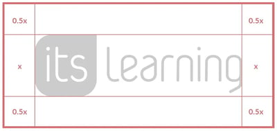
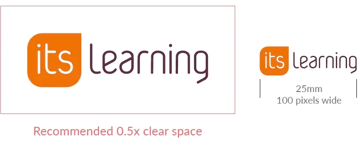
Our logo works best when it has room to breathe, so always leave enough clear space around it to maintain its impact and legibility. The minimum clear space should be 0.5x on all sides. For the same reason, avoid using the logo at very small sizes, whether in print or on screen.

Used in corporate communications e.g. Press releases, tenders and legal documents
The logo mark acts as a subtle brand signature across communications. Unless otherwise specified, place it in the bottom-right corner, maintaining the required clear space and minimum size. The mark should support the content, not compete with it, and should never replace the full logo where clear brand identification is required.
Consistency is essential to maintaining a strong brand, so always use our logo and brand assets correctly across every application. The examples below show some common mistakes to avoid, along with the correct approach. If you are ever unsure, do not guess. Check with the Marketing team before using the logo or any other brand assets.

Poor contrast. Don't do this!

Do this!

Poor contrast. Don't do this!

Do this!

Incorrect proportions. Don't do this!

Do this!
Our primary orange is the most recognisable expression of our brand, but it should not dominate. It is mainly reserved for brand elements such as our logo, as it does not meet accessibility guidelines for wider use in digital experiences.
For digital applications, we have introduced a supporting orange with stronger contrast. This meets accessibility requirements while maintaining a clear connection to our brand. Together with our wider colour palette, it helps organise information, create visual flow across longer pages and add personality without weakening brand recognition.
Use for calls to action, promotions and featured content. Conveys energy, confidence and optimism. Pair with the matching tint to highlight key sections.
Use for information, guidance and customer support. Pair with the matching tint to create calm, approachable layouts.
Use for innovation, digital products and creative initiatives. Pair with the matching tint to add visual interest.
For corporate communications, strategic messaging and leadership content. Pair with matching tint for a structured look.
Use for sustainability, wellbeing and positive outcomes. Pair with the matching tint to create fresh, supportive layouts.
Use for campaigns, community initiatives and engaging content. Pair with the matching tint to create inviting, expressive layouts.
Use for premium services, thought leadership and editorial content. Conveys sophistication, balance and creativity. Pair with the matching tint for subtle distinction.
Conveys clarity, neutrality and accessibility. Pair with the matching tint to provide a clean, understated and versatile foundation to you presentation materials.
Use the primary colours for emphasis and the matching tints for occasional background treatment.
Where possible, white should remain the dominant background colour.
Illustration and iconography each play a distinct role within our visual system. Illustrations add clarity and personality, and icons improve understanding and usability. Together, they create a cohesive brand experience that supports clear communication and reflects our commitment to helping educators and learners succeed.
Pre-purchased hours that give you flexible access to consultancy and training throughout the year, allowing you to respond confidently to emerging priorities.
Use your hours for tailored professional development, induction training for new staff or targeted workshops designed around your school’s specific goals.
Draw on expert support for digital teaching development, implementation planning and strengthening consistent practice across departments.
Allocate hours to integration consultancy, site health checks and configuration reviews to ensure your platform remains secure, efficient and aligned to your needs.
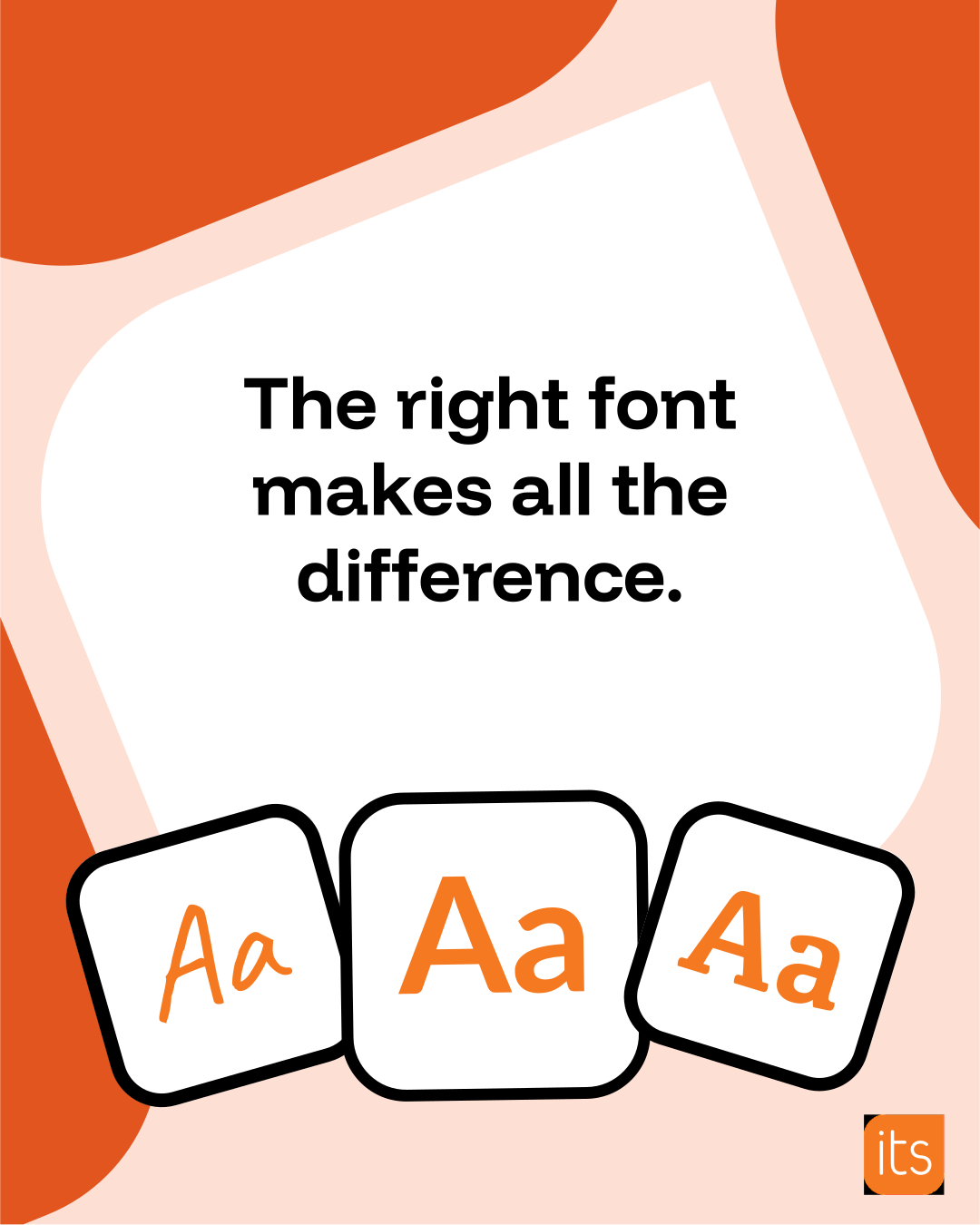
Typography helps create a consistent and recognisable itslearning experience. Use Funnel Display to create personality and hierarchy, while Lato ensures clarity and accessibility across product and marketing experiences.
Use changes in font weight and colour to draw attention to key words within a heading. This helps emphasise the target audience, a core message or an important topic while maintaining a clean and consistent typographic style.
One System.
Smarter Learning.
Bigger Impact.
Funnel Display brings a more distinctive and characterful tone to our headings, helping us establish a clearer visual hierarchy and a more memorable brand presence. It pairs well with Lato, maintaining overall readability while giving our marketing content more impact.
We never use all caps with this font.
Lato is the font we use throughout our product. It's a sans-serif font that's accessible, easy to read, and includes the characters we need across the languages we support. We also use Lato in our marketing materials to create a consistent experience and build familiarity with our brand.
Motion is an important part of our visual identity. It helps us guide attention, explain ideas and bring our brand to life. When creating animations, videos or motion graphics, we aim for movement that feels clear, confident and purposeful.
We keep the itslearning brand recognisable throughout our videos without placing the logo on every frame. The logo can appear in an introduction and should be included on the final screen, whether as a static mark or an animation. We choose the ending to suit the message: product and brand videos may use the animated logo, tagline and website address, while campaign or event videos may give the final screen to a call to action or key message alongside the logo. Where an animation is used, its sound can be omitted if the video’s existing audio should continue.
See Outro Video
We use motion to help viewers follow what is happening on screen. A gentle scroll can reveal the structure of a page, while a subtle zoom can bring a particular feature into focus. In training videos, we use callouts to introduce topics and guide attention to the relevant parts of the product. When a video has no voiceover, callouts can also carry the explanation. We keep them clear and carefully placed so the interface remains easy to see and understand.
Video content should follow the itslearning typography guidelines, using approved fonts, hierarchy and styling consistently across all on-screen text. This keeps videos recognisably part of the wider brand, while sufficient contrast and display time ensure the text is comfortable to read.
We use a consistent lower-third style to introduce speakers clearly without drawing attention away from the main content. It uses our primary orange with white text and can be adapted for presentations, social videos, webinars and other speaker-led content.
See an example
We build accessibility into every stage of video production. Our prerecorded videos have accurate, synchronised captions, readable on-screen text and narration that explains important visuals where needed. We use clear directions such as “Select **Add** in the top-right corner of the Planner”, avoid flashing effects, keep movement controlled and never rely on colour alone to convey meaning. See it. Hear it. Read it.
We avoid visual treatments that add movement or complexity without supporting the content:
Our visual language combines photography, illustration and iconography to create a brand that is approachable, engaging and easy to understand.

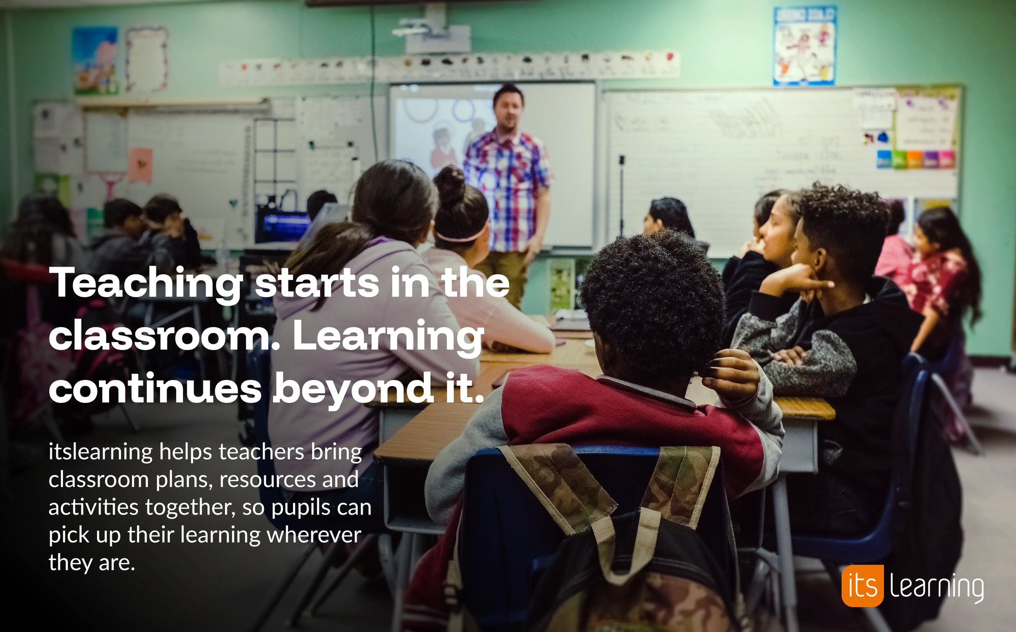
Our photography should capture real moments of learning, connection and progress. Choose images that show learners participating, creating or collaborating, teachers supporting them and technology used naturally. Look for moments of concentration, curiosity and achievement. People should feel at ease and engaged, with a mix of close-up and wider shots that reflect the diversity of learning.
Keep compositions clear, with an obvious subject and space for copy where needed. Favour eye-level perspectives, soft natural light and warm, balanced colour. Avoid heavy filters, staged expressions, obvious stock imagery and stereotypes. Each image should add something meaningful to the story while feeling human and credible.
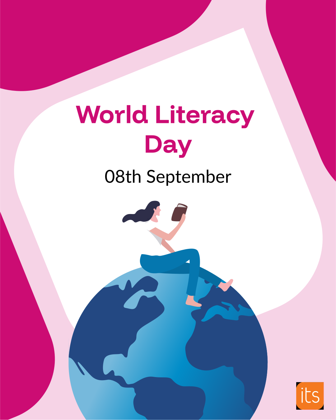
Our illustrations help bring educational concepts, platform features and learning outcomes to life. They are used to simplify complex ideas, support storytelling and make information easier to understand. Illustration also adds warmth and personality to our brand, helping us communicate in a way that feels approachable, inclusive and engaging.
Illustrations are particularly effective when explaining functionality, highlighting benefits or visualising concepts that are difficult to capture through photography alone. They should be clear, purposeful and consistent in style, supporting the message rather than distracting from it.
If you need assistance selecting or creating appropriate icons, please contact the marketing team.
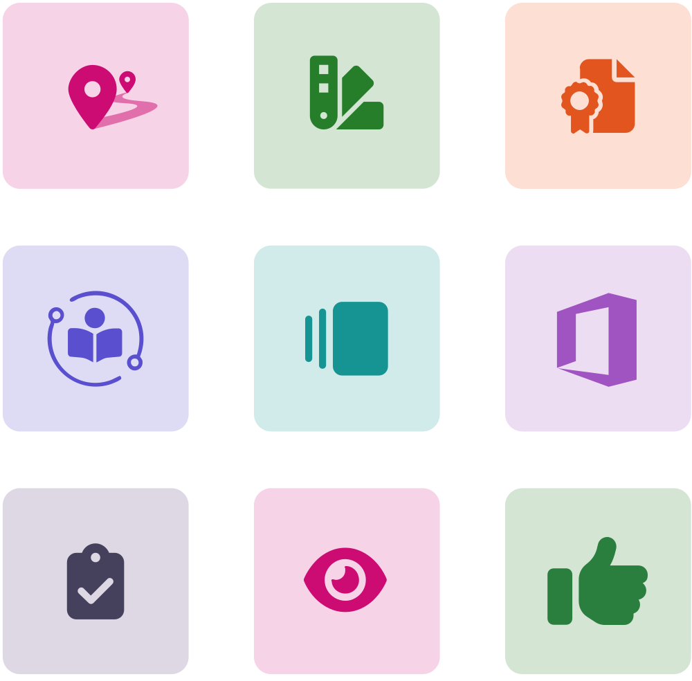
Icons provide visual cues that improve navigation, comprehension and accessibility. They help readers quickly identify features, actions and key information across our communications. Icons should be simple, recognisable and used consistently throughout the brand.
To strengthen the connection between our marketing pages and the platform, we have adopted the same icon style used in the product, creating a more consistent and recognisable experience.
All colour combinations have been tested against accessibility contrast requirements and are fully compliant. As such, these colours should not be altered.
The wheel can be used in presentations, product communications and educational materials to demonstrate how itslearning supports teaching and learning. Preserve the six stages, their sequence and the continuous direction of the arrows.
Plan courses, lessons and IEPs in alignment with curricula, individually or collaboratively.
Engage learners with resources and apps best suited to their learning styles.
Teach using your preferred strategies while enjoying optimised workflows for assignments, assessments and grading.
Assess mastery against local or regional prescribed objectives.
Reflect on teaching and learning efficacy with peer reviews and portfolios.
Report on outcomes, course effectiveness and school or municipality performance.
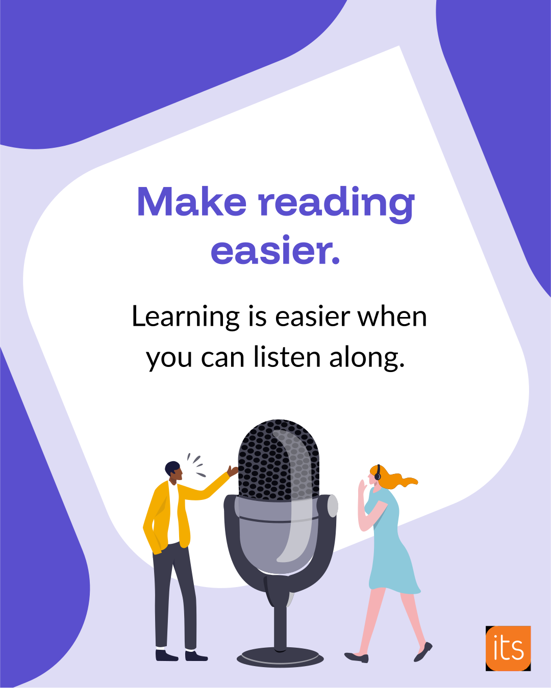
Our social images and Reels use the same visual language as other itslearning content. We use our typography, colour pairings and highlight treatments consistently across formats. In Reels, captions, lower thirds and motion also help make the content recognisably ours.
Social content gives us room for more energy and variation. We choose from our approved brand colours to suit the subject: orange can give company stories a stronger brand presence, purple can distinguish product content and Ocean Blue can support guidance or customer stories. Other approved colours can be used where they support the message or campaign. Reels can move at a different pace from training videos, but movement should still help viewers follow the story.
We design images and Reels around the space viewers can actually see. Images may be cropped in different placements, while account details, captions and interaction buttons can cover parts of a Reel. Our templates show the clear viewing area for each format. We keep faces, headlines, product details, subtitles and other essential content within it, then check the finished post in its intended placement.
We caption spoken content in Reels so it can be followed without sound. Short phrases give viewers time to read and understand the message. We may show a single word for emphasis, but we avoid presenting full sentences one word at a time when the pace makes them difficult to follow. We check captions for accuracy and include meaningful audio information where needed.