See why schools choose a European LMS designed for education over generic platforms.
Product update: redesigned course menu
Translation generated by an AI translation service
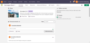
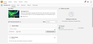
New Course Menu Design
As part of our efforts to enhance the itslearning interface, the course menu has been redesigned. This update ensures a consistent look and feel between the main menu and the course menu, making navigation more intuitive. Both menus are now more accessible and aligned with the latest advancements in educational technology.


Timeline
To simplify our menus, we’ve reorganised and streamlined where you find certain items. Some items have been merged, while others have been relocated. We understand that adapting to these changes can take some time, even when they enhance navigation. Rest assured, our dedicated teams have rigorously tested the new menus. They will be released in late Summer.
A Leap Forward in Accessibility
This change is driven by our core value of accessibility. By simplifying the menu with fewer items, we are not only making navigation easier but also preparing for a seamless integration with the upcoming new main menu.
Benefits at Your Fingertips
- Enhanced Keyboard Navigation: Move through the platform with intuitive keystrokes.
- Screenreader-Friendly: Experience improved interactions for visually impaired users.
- Cohesive Look and Feel: By releasing these changes at the same time, users will experience the same look and feel when moving from the main menu to the course menu

A Glimpse into the Future
For educators, the transformation will be both visual and functional:
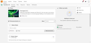
- Streamlined Student View: The “View as” feature is now a singular, focused “Student view,” relocated to an action menu for clarity.
- Simplified Settings: The trash can icon finds a new home within Settings, reducing clutter.
- Revamped Reports: 360° reports are now part of the rebranded “Reports” section, formerly known as “Status and follow-up.”
- 3rd party modules: Third-party modules are neatly organized in an “Apps” dropdown.
- Course Link Collection: While existing links remain, we are planning for their eventual phase-out.
Navigating Change
As we move to this new interface, we understand it may feel different from what you’re used to. However, we believe you’ll quickly adapt to the changes, as the number of clicks remains the same but are now more intuitively placed.
We are here to support you during this transition and can revert settings if any major issues arise. Please note that this is a universal update, and the old menu will no longer be available.
To see more upcoming product improvements, visit our roadmap!


