WHY ITSLEARNING
See why schools choose a European LMS designed for education over generic platforms.
See why schools choose a European LMS designed for education over generic platforms.
itslearning empowers teachers and helps all students reach their full potential.
Translation generated by an AI translation service
At itslearning, we believe in continuous improvement to make your experience on our platform more enjoyable and accessible. Over the past year, we've dedicated our efforts to refining the design and accessibility of our icons. This includes increasing their contrast and making them more consistent, modern, and meaningful.
We are updating all icons on the platform to deliver more consistent and accessible visuals. Below, you can compare one of the sections we have updated. Please note that we are not changing the layout, titles, workflow, or functionality. This change is solely to enhance the icons.
We anticipate that all icons will be available for the 2025 back-to-school season.
These changes will make itslearning more user-friendly and visually appealing for everyone. Please note that we will not change icons that represent external providers, such as Microsoft.
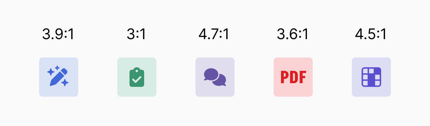
Color contrast is determined by the lightness (luminance) of the colors rather than their hue. This means that the inner shape and background can share a similar hue (e.g., red, green, or blue) as long as the contrast ratio meets WCAG standards—a minimum of 3:1 for non-text elements (Success Criterion 1.4.11: Non-text Contrast).
Below are examples of new icons, along with the contrast ratios of their meaningful shapes based on relative luminance. All combinations comply with WCAG requirements.
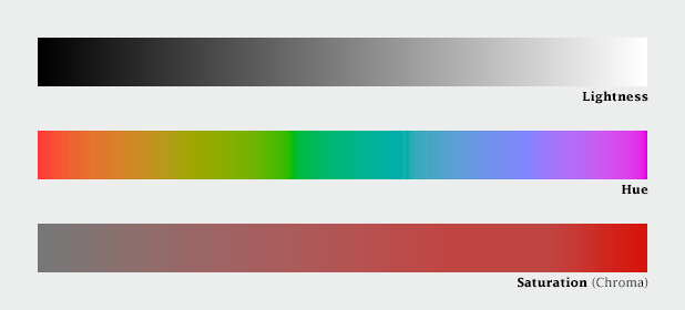
Colors are defined by Lightness, Hue, and Saturation, but for accessibility, Lightness is the most crucial factor in ensuring sufficient contrast and visibility.
Note: Some of the icons displayed may be subject to change.